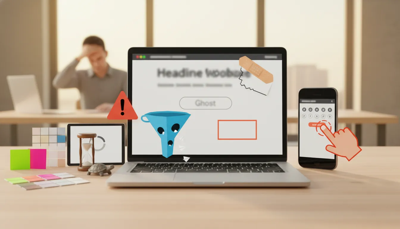
The 5 warning signs your DIY website is costing you leads
TL;DR
Want us to build this for you?
Book a Free Discovery Call- Your DIY site may look "good enough" — but if visitors are confused, the site is slow, or there's no clear next step, you're losing leads every day.
- Watch for five clear red flags: unclear message, slow pages, DIY design, poor mobile experience, and no obvious call to action.
- Fix the basics (headline, speed, trust signals, mobile usability, and one clear CTA) and the traffic you already have will convert into real enquiries.
Why this matters
Want us to build this for you?
Book a Free Discovery CallEvery click that lands on your website is an opportunity. A DIY site that looks fine to you can still be leaking leads if visitors leave before they understand what you do or how to contact you. Small usability problems — vague headlines, slow loading, mismatched design, tiny tappable targets, or buried contact options — all add up to a big sales problem.
The five warning signs (and what to do first)
Want us to build this for you?
Book a Free Discovery Call1. Visitors land on your site and still have no idea what you do or who you help
Why it hurts: If your headline is generic and pages are full of vague copy, people bounce before they ever consider reaching out.
- Fix it: Rewrite your headline to be specific and benefit-driven. Tell visitors who you help, what you do, and the outcome — in one short sentence above the fold.
- Example: "We build modern websites for small contractors that win local clients" is better than "Welcome to our website."
2. Your site is slow
Why it hurts: Load time is a conversion killer. If pages take more than a few seconds — especially on mobile — users hit back and go to a competitor.
- Fix it: Compress images, enable browser caching, remove unused plugins or scripts, and run a speed audit. Aim for a fast mobile first load. For a deeper dive, see our guide on why a slow website costs local businesses phone calls and leads.
- Priority: Start with images and third-party scripts — they're often the quickest wins.
3. It looks obviously DIY
Why it hurts: Inconsistent fonts, clashing colours, and dated layouts reduce trust. People hesitate to give money or book a service with a site that looks unprofessional.
- Fix it: Choose a simple, consistent type scale and a restrained colour palette. Use clear spacing and modern layouts — a little design polish goes a long way for perceived credibility.
- Quick wins: Use one heading font and one body font, align buttons and forms consistently, and remove decorative clutter.
4. It is painful on a phone
Why it hurts: More than half of traffic is mobile. If visitors must pinch and zoom, menus are tiny, or buttons are hard to tap, they leave before contacting you.
- Fix it: Test on actual phones. Increase tap targets, simplify navigation, and make forms short and thumb-friendly.
- Priority items: Large contact button, single-column layouts, and forms with as few fields as necessary.
5. There is no clear next step
Why it hurts: If the contact button is buried, forms are long, or there are too many competing links, people don't know what to do — so they do nothing.
- Fix it: Create one prominent, obvious next step (call, form, or booking). Make the CTA visible on every page and keep the form short.
- Test: Remove secondary links on key pages and measure whether enquiries increase.
Quick fixes checklist
Want us to build this for you?
Book a Free Discovery Call- Headline — make it specific: who + what + outcome.
- Speed — compress images, audit scripts, aim for under 3s mobile load.
- Design — unify fonts, colours, and spacing for a trusted look.
- Mobile — enlarge tap targets, simplify nav, shorten forms.
- Conversion — add one clear CTA and a short contact form or booking link.
When to stick with DIY and when to hire a pro
Want us to build this for you?
Book a Free Discovery CallIf your website only needs headline tweaks, image compression, and a clearer CTA, you can often fix those yourself in an afternoon. But if multiple warning signs show up — slow performance, inconsistent design, and poor mobile usability together — the problem is no longer cosmetic. That's when a professionally built site, like the ones built through our web design service, can turn your existing traffic into real enquiries instead of lost opportunities.
Final thought
Want us to build this for you?
Book a Free Discovery CallYour DIY website isn't just a design issue — it's a lead problem. Fix the basics and the same visitors who already find your site will start picking up the phone, filling out forms, and booking work. Small changes yield measurable results, and pairing a fixed-up site with conversion rate optimization (learn what CRO is and why your website needs it) or local SEO can compound those gains further. For the complete list of conversion killers to check, see our guide on why your website might not be generating leads.
FAQs
Want us to build this for you?
Book a Free Discovery CallHow do I know if my homepage headline is the problem?
If visitors leave within a few seconds and analytics show high bounce on the homepage, your headline or above-the-fold messaging is likely the issue. Do a simple test: rewrite the headline to clearly state who you help and the main outcome, then measure engagement.
What's the fastest way to speed up a slow site?
Start with image compression and removing unused plugins or slow third-party scripts. Then enable caching and a basic performance plugin or CDN. These actions often deliver the biggest improvements quickly.
How many fields should my contact form have?
Keep forms as short as possible. For initial enquiries, ask for name, phone or email, and a one-line description. You can collect more details later in a follow-up call or booking flow.
Can a redesign alone fix lead problems?
A redesign can help, but only if it addresses messaging, speed, mobile usability, and conversion paths. Design without clarity or performance improvements won't reliably increase leads.
How do I test mobile usability quickly?
Open your site on a few different phones and try common tasks: find pricing, call you, and submit the contact form. If any step requires pinching, scrolling through dense text, or hunting for buttons, make that a priority fix.
Ready to turn your traffic into real enquiries? Book a discovery call with Certtech Web Solutions to discuss how we can help your website convert.